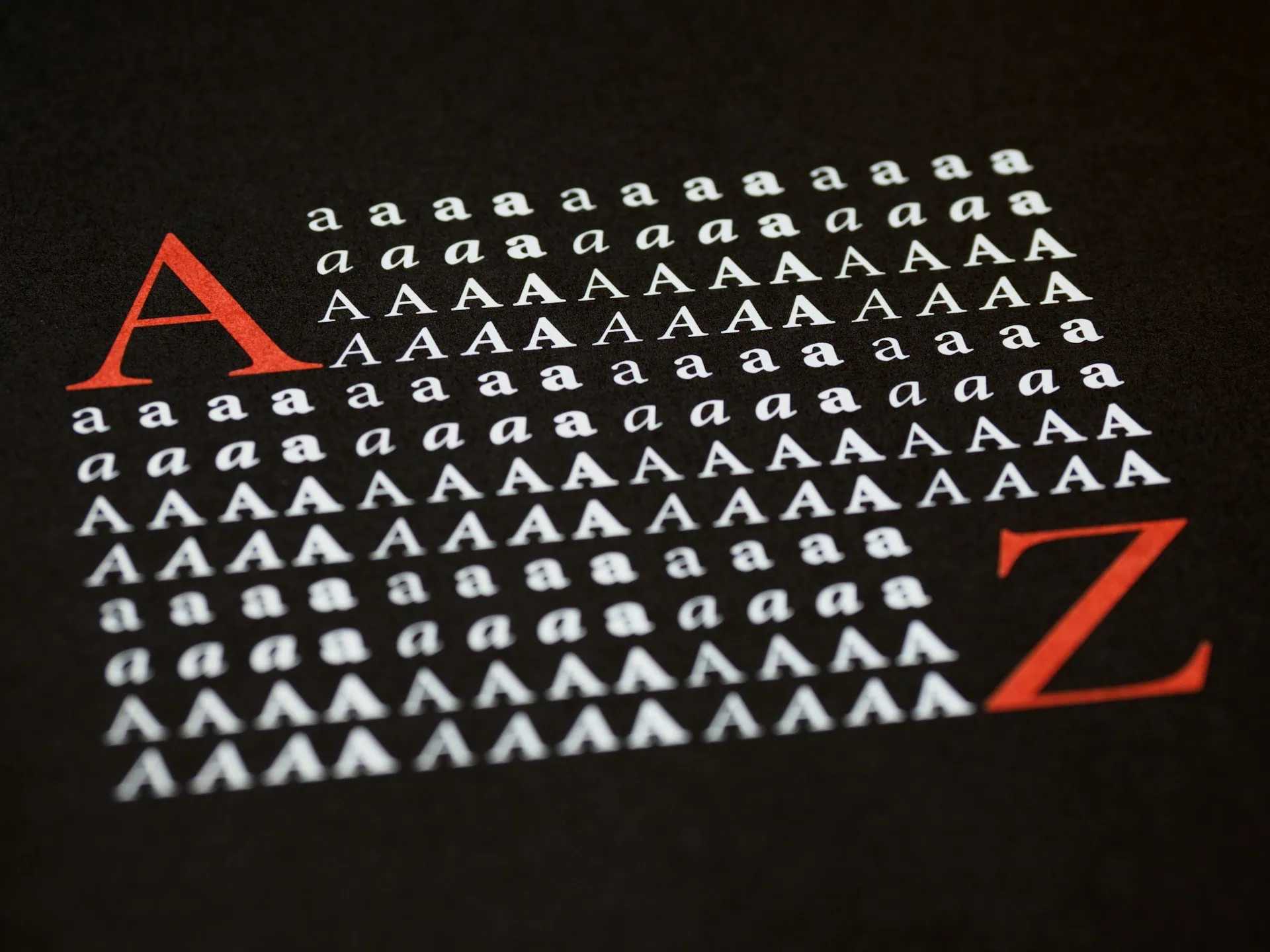
In the vast ocean of branding strategies, one often overlooked yet crucial aspect is typography. The font you choose to represent your brand can significantly impact how your audience perceives your message, personality, and overall identity. Just like colours and logos, fonts play a vital role in conveying your brand’s essence. So, how do you go about selecting the ideal font for your brand? Let’s delve into the art of typography and explore some key considerations.
Factors to consider when choosing a font
- Reflect Your Brand Personality:
Fonts have personalities too. They can be formal, casual, elegant, playful, or even futuristic. Before diving into the sea of typefaces, take a moment to define your brand’s personality. Are you aiming for a sleek and modern vibe, or do you want to evoke a sense of tradition and heritage? Your font choice should align with the personality you want to convey. - Consider Legibility:
While creativity is important, never sacrifice legibility for style. Your audience should be able to read your brand name and message effortlessly. Opt for fonts that are clear, well-spaced, and easy on the eyes, especially in digital formats where readability is paramount. Remember, if your audience struggles to decipher your message, they’re likely to lose interest quickly. - Versatility is Key:
A font that looks fantastic in your logo might not be practical for body text or smaller formats. Choose a font that offers versatility across various applications. It should scale well, maintaining its readability and aesthetic appeal whether it’s on a billboard or a business card. Additionally, consider how the font performs across different mediums, such as print, web, and mobile devices. - Understand Font Categories:
Fonts can be broadly categorized into serif, sans-serif, script, and display types. Serif fonts, with their decorative strokes, often convey tradition and sophistication. Sans-serif fonts, on the other hand, are clean and modern, ideal for conveying simplicity and minimalism. Script fonts exude elegance and creativity, while display fonts are attention-grabbing and best suited for headlines and logos. Understanding these categories can help you narrow down your options. - Test, Test, Test:
Don’t rush into a decision. Take the time to test various fonts and see how they resonate with your brand identity. Create mock-ups, experiment with different combinations, and gather feedback from your target audience if possible. It’s essential to assess how each font aligns with your brand values and messaging before making a final choice. - Stay Consistent:
Once you’ve chosen a font (or a combination of fonts), stick with it. Consistency is key to building brand recognition and trust. Use your chosen fonts across all brand assets, including your website, marketing materials, social media posts, and packaging. Consistent typography reinforces your brand identity and helps create a cohesive visual experience for your audience.
License-free options
If you want to avoid any fees and don’t want to consider paying for a font yet, there are lots of fonts to choose from within the license-free category. Most notably, Google’s fonts are very popular due to their availability and ease of use. Another option is Fontshare who have a variety of fonts to choose from.
In conclusion, choosing the right font for your brand is a blend of art and strategy. It’s about finding a balance between creativity and practicality while ensuring that your typography effectively communicates your brand’s personality and message. By following these guidelines and paying attention to the nuances of typography, you can create a lasting impression that resonates with your audience for years to come.

